Plunge: Dark Mode
Creating a brand new theme from the ground up for all mobile users of Plunge — alongside a system of colour mappings and guidelines internally for our product team.
Role:
Lead Designer
Platforms:
iOS, Android
Areas:
Strategy, Design, UX/UI
Background
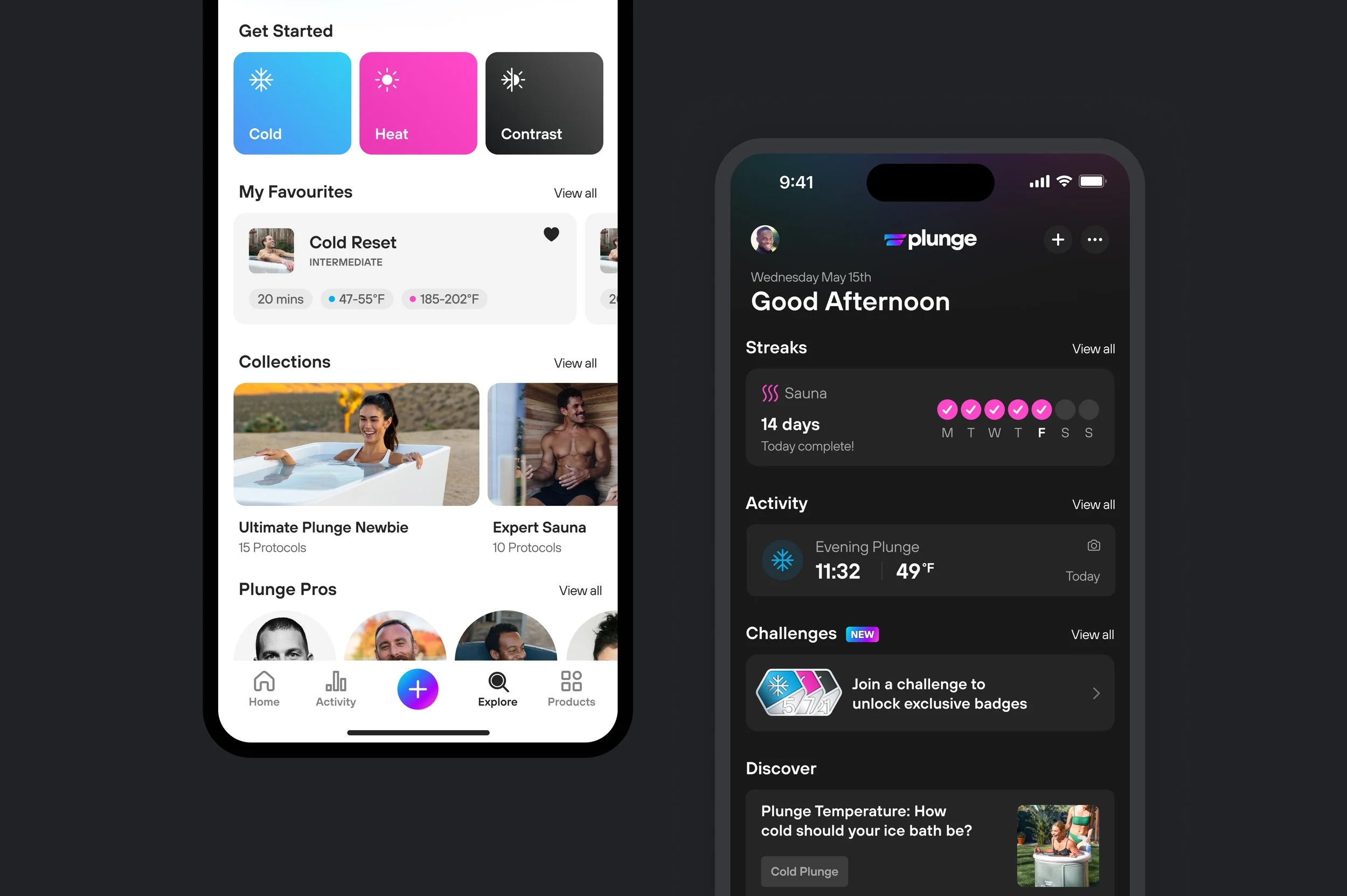
The motivation for dark mode to be supported on the Plunge mobile app didn’t happen overnight. Since the start, our app only had a default light theme — and in recent years, dark mode has been a highly requested feature through app store reviews and other feedback channels.
For both myself and the engineering team, we are always in favour of the initiative to improve accessibility and follow industry best practices. In 2024, we officially added dark mode to the roadmap — while also knowing it would be a difficult challenge with many constraints and considerations.
Approach
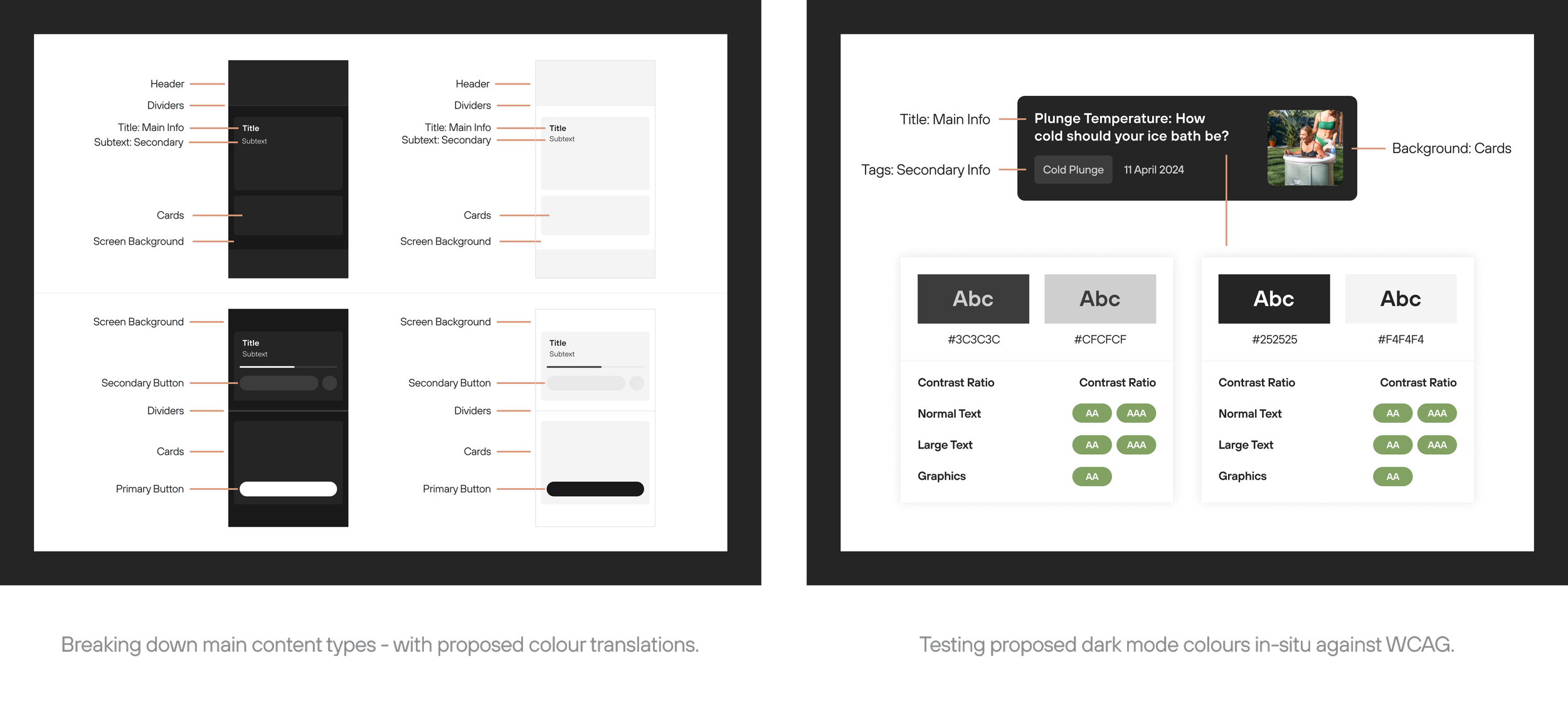
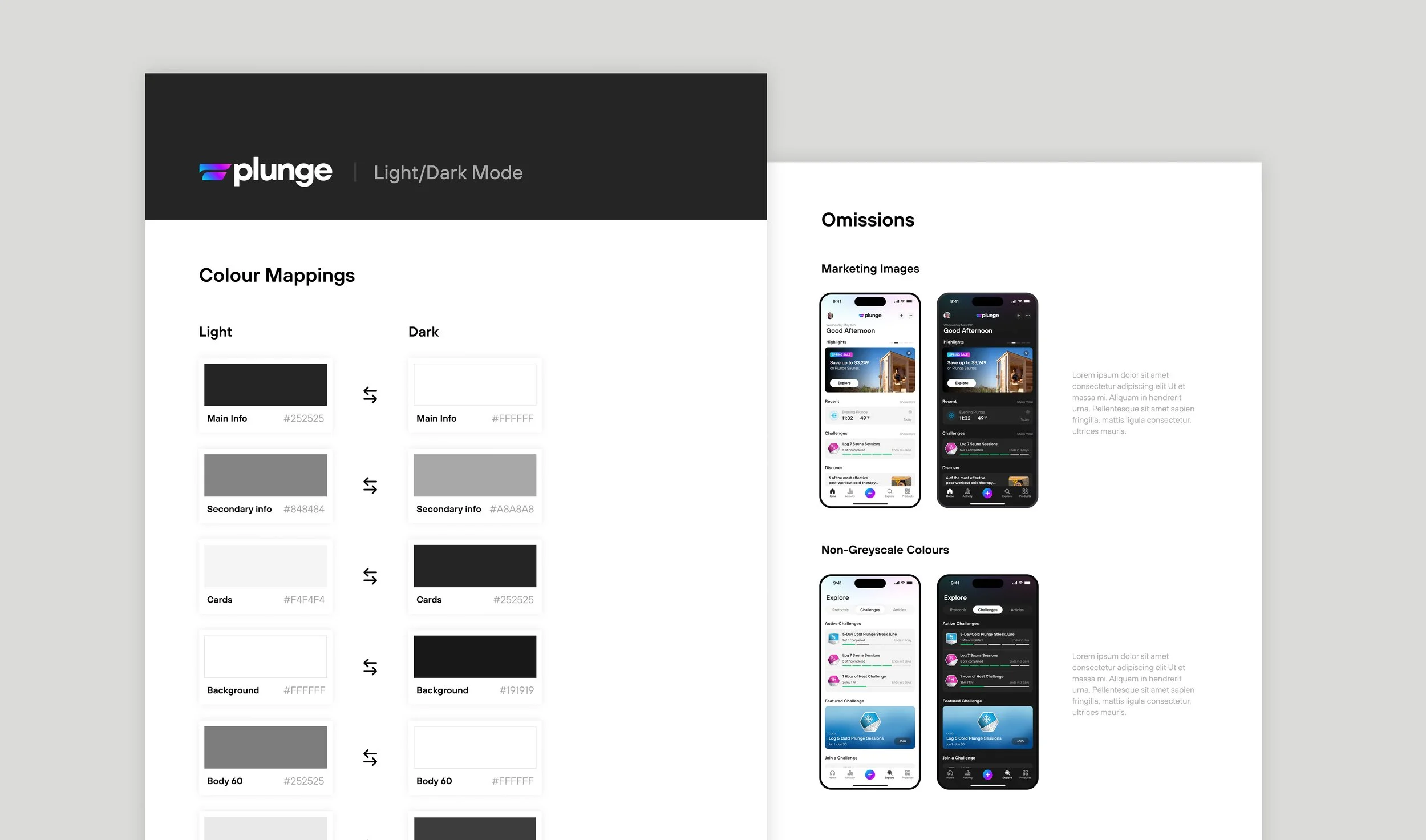
As the lead designer on this project, I had two main goals — creating a scalable system which the engineering team could easily follow, while designing the best possible experience for the end user.
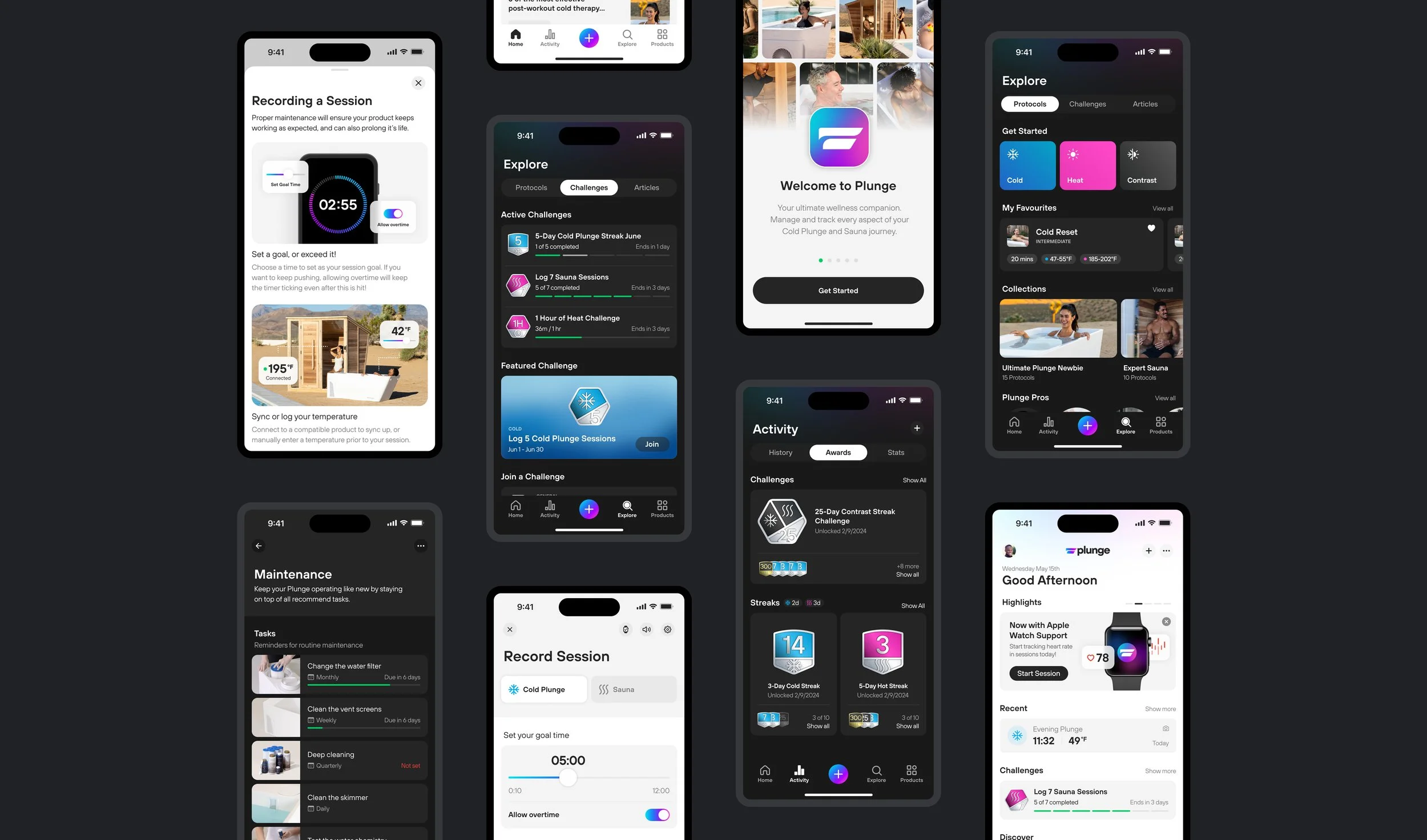
After some trial and error, I was able to create a set of light to dark mappings for each grayscale colour in our design system. Next, I populated our Figma library with the mappings, educated the engineering team on usage, and provided a document highlighting all of the guidelines and exceptions.
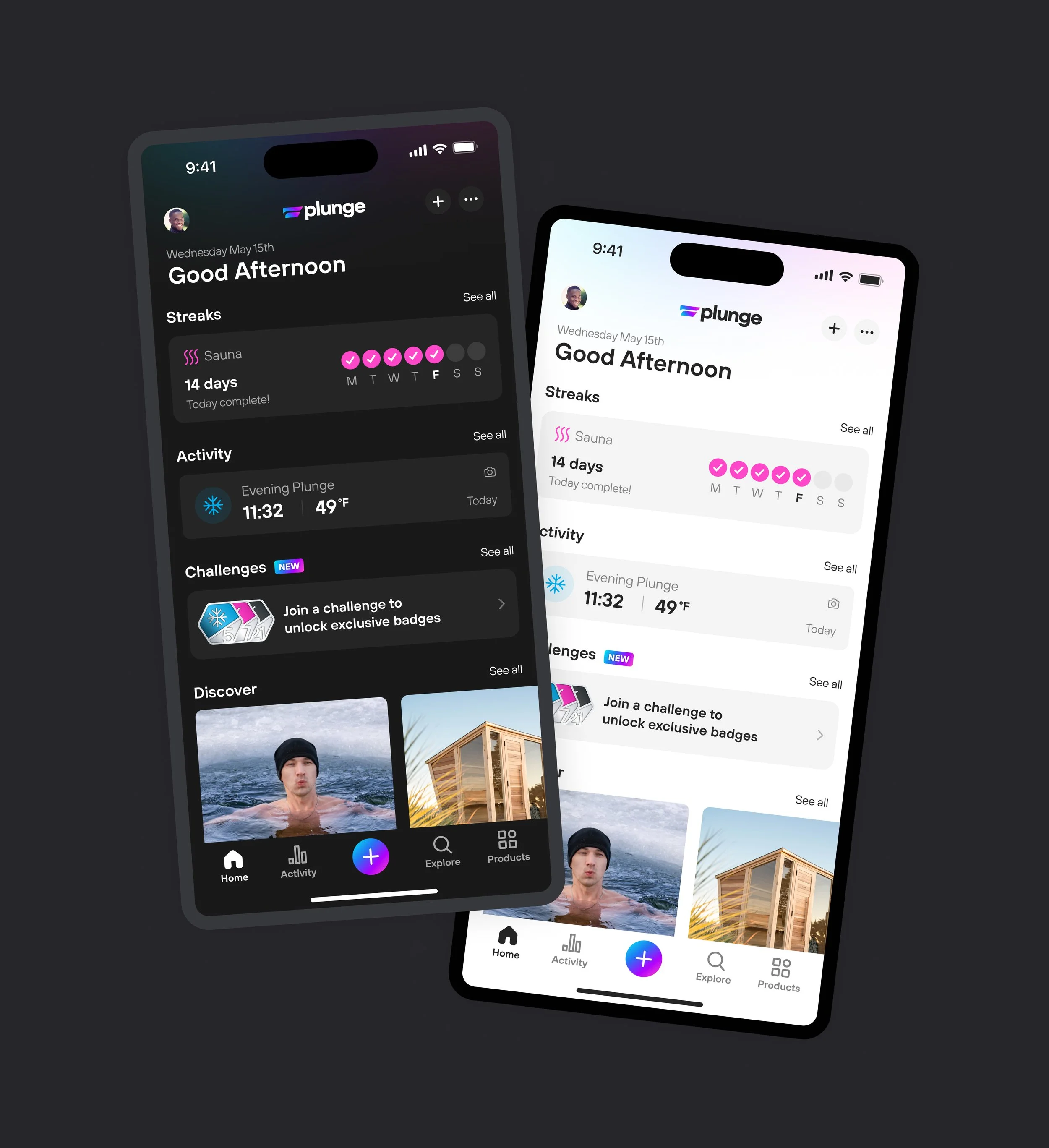
For the end user, in order to highlight the new theme option and make it easy to opt-in, I designed an animated callout to launch with the feature.
Impact
Post launch, our analytics team tracked the impact of dark mode on core metrics. The results showed a sizeable increase in the overall usage of our app.
Session frequency:
+ 9.2%
Sessions logged:
+ 17.6%